Here at Vizergy, we love to brag on our hard-working teams that create amazing work, and we want to reflect on an awesome project we did for Bally’s Corporation. Bally’s came to us needing several new websites – for their brand and for twelve properties.
Vizergy was initially approached by the Bally’s team and Megan McGuinness of McGuinness Media & Marketing to develop a web concept that would be central to the rebranding of Bally’s portfolio of casino resorts and gaming properties. Beyond aesthetics and growing brand recognition, the goal of the project would be to create an ecommerce platform that would drive direct bookings and increase asset value for the property owners. This would mean tying together new brand assets, a reward program, and a variety of F&B offerings into a single cohesive digital marketing plan. All of this would be tied together and powered by the Vizergy Marketing System.
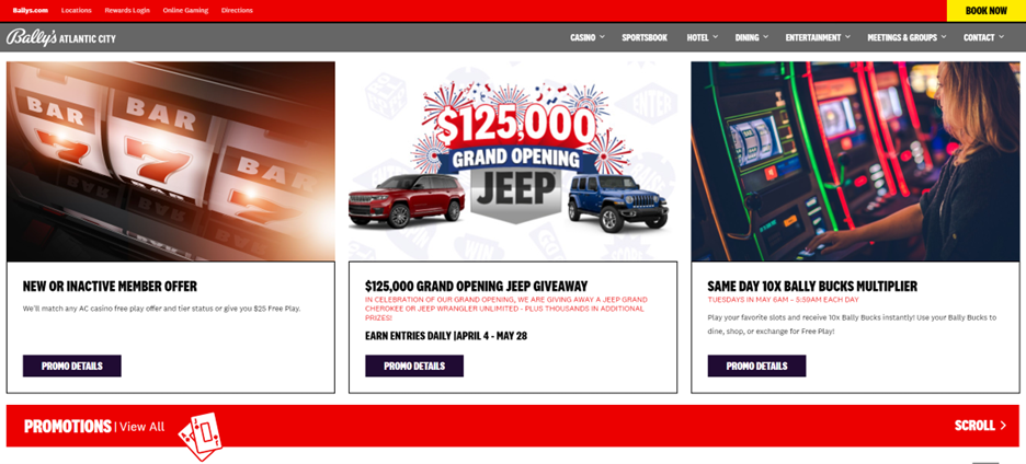
The first step was to create a design that had the flexibility to provide each property the ability to show off its unique features and amenities, while being streamlined enough to give a bit of continuity across the Bally’s portfolio. Once the overarching design vision had been established, we got to work making building 12 property sites that would present each property as a new chapter to a larger Bally’s story.
Creative Director Jeremiah Mathews said of the project, “Bally's and McGuinness both have incredible brand awareness, which made creating a site that catered to their customer base very simple and streamlined. The use of custom designed location layouts empowers property managers and owners to make their own changes through our user-friendly CMS.” Working in conjunction with Bally’s, McGuiness Media & Marketing, and each individual property allowed the Vizergy team to collectively deliver some pretty fantastic results.
One of the best things we built for their website were two intuitive and responsive widget feeds for both their promotions and events pages. When the property adds a new promotion or event to their subpage, it automatically populates into a carousel on the home page to drive potential customers to buy tickets or make a direct booking. The same logic applies to putting the appropriate CTA’s directly under the first image on the home page.

Another unique feature of these sites can be found on the dining page. While most restaurant pages utilize PDFs to showcase their menus, we took it a step further. We integrated their menus for each restaurant into extensive tabs, which also makes the menus easily read by screen readers (making the site even more ADA friendly!). We also included OpenTable integrations for each restaurant, making it easy for customers to make reservations. .
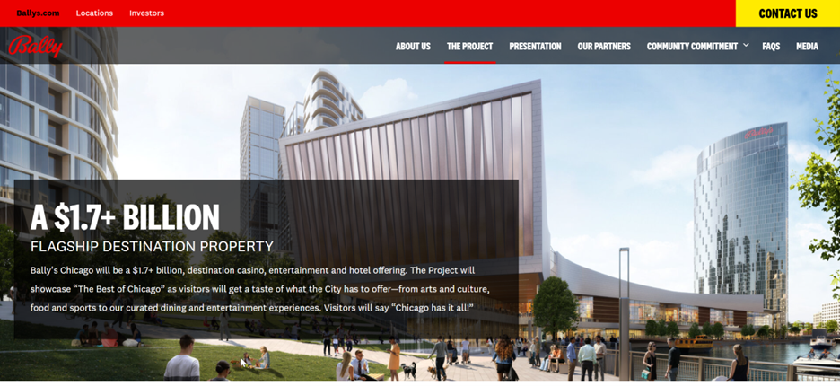
While these sites followed a pretty set layout, we also had the opportunity to make something new and exciting for Bally’s. They’re currently working on pitching the city of Chicago on a new casino and hotel, and they utilized our services to make a website that allows them to better present their vision to the city and community of Chicago.

The website includes community initiatives, design plans, budget proposals, and numerous other resources for those interested in what Bally’s is building in Chicago.
Bally’s websites offered a unique challenge to our design team, but we think they rose to the occasion and knocked these builds out of the park. Bally’s and McGuiness Media & Marketing were great creative partners that helped drive the vision and create the brand identity we wanted to communicate. We future-proofed their sites, so their pages can grow as the company grows. This will make it easy for Bally’s to add new properties within this existing structure and still remain a cohesive brand.
